Dove deep into past and latest research
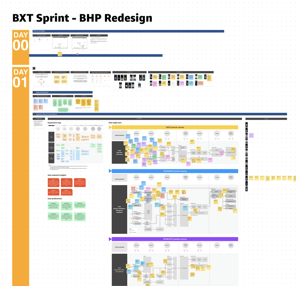
Organised 4-day cross-partner design sprint
Testing hypothesis with key user segments
Iterated and secured alignments from partners

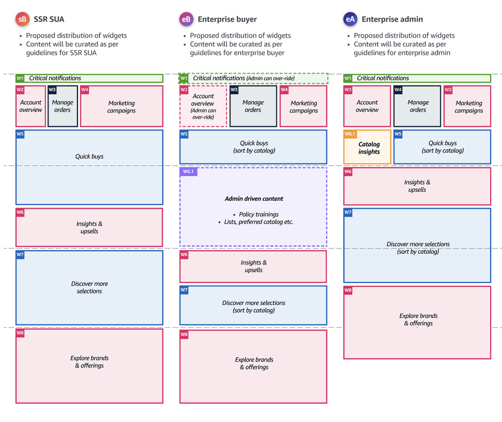
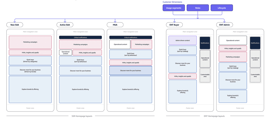
Defined UX vision for desktop and mobile
Taking UX vision to experimentation
I organised a design sprint with 13 participants including stakeholders from Marketing, Personalisation, Ads, Customer advisors and UX.
The exercise was essential in getting alignment on customer problem and approach to transform homepage, and potentially avoid churn in later stages
Challenge
To define a long term UX vision to create personalised homepage catering to key user segments which will enable them to achieve their goals
My role
As a UX owner, I closely collaborated with research, product and tech partners, came up with UX vision and drove alignment across charters
Team
UX owner (Myself), Product manager, 3 Partner teams, Principle UX, Tech teams
Highlights
3 Leadership reviews
AB UX Star award
AB Special recognition
Impact
Leadership alignment,
Cross-partner alignment,
Informed product road map
Approach
Given the complexity, scale and vested interests in the project, I approached it from a holistic as well as collaborative mind-set, whilst keeping the user at the core.
Highlights
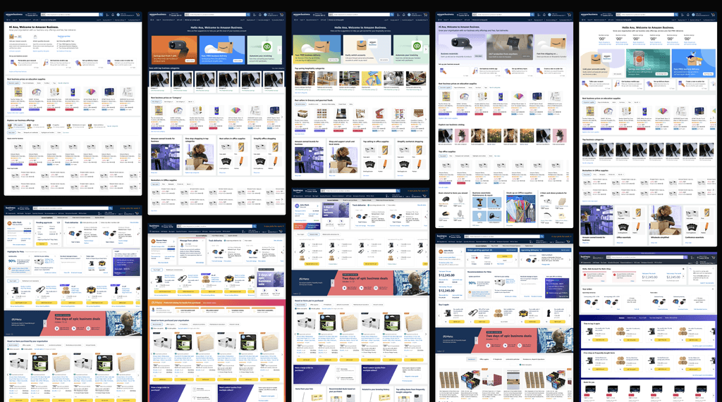
80+ ideas, 50+ sketches, 1 problem statement and 3 key user segments
Outcome
Alignment on directions, 3 concepts and hypothesis to validate
Learnings
It is essential to build user empathy with partners to help re-frame product goals which are user-centric
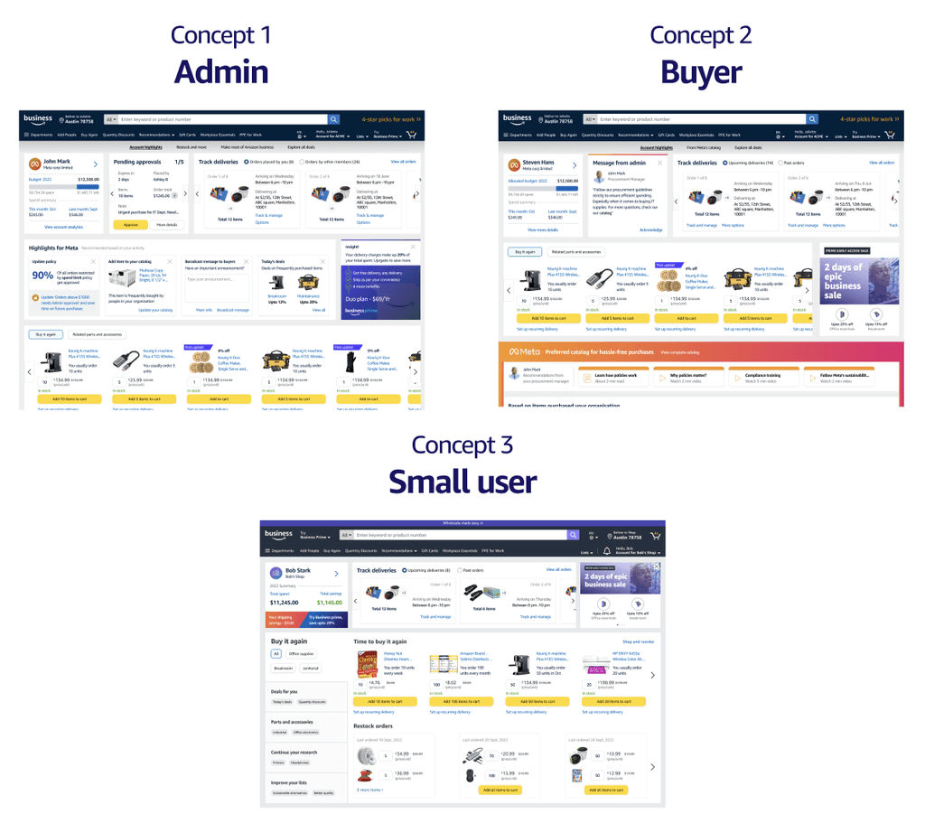
Testing key hypothesis
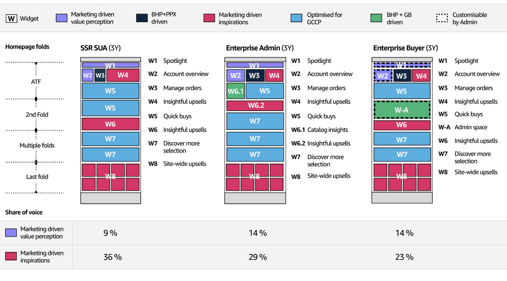
I created 3 concepts of the homepage based on user segments we identified in the workshop. With the help of our researcher, we tested them and validated against relevancy, business feel and value
Secured alignment from partners
This had been the most frictional part of the project. I proposed to remove certain widgets which were identified as irrelevant by users but were key to partners. Following the discussions, I realised the need to convey how new vision would enable better mechanisms, which eventually helped to un-block the project.
Highlights
3 rounds of presentations and multiple iterations
Outcome
Key partners aligned,
Extended partners directionally aligned,
Shared partner goals
Learnings
It is key to convey potential partner opportunities by created a scalable UX framework and advocating to users all through-out
Positives
“All these things are curated for Meta for my activity. I love that.”
Outcome
“All of this talks to me, this is great.”
Negatives
“It has a lot of information; it could look crowded.”
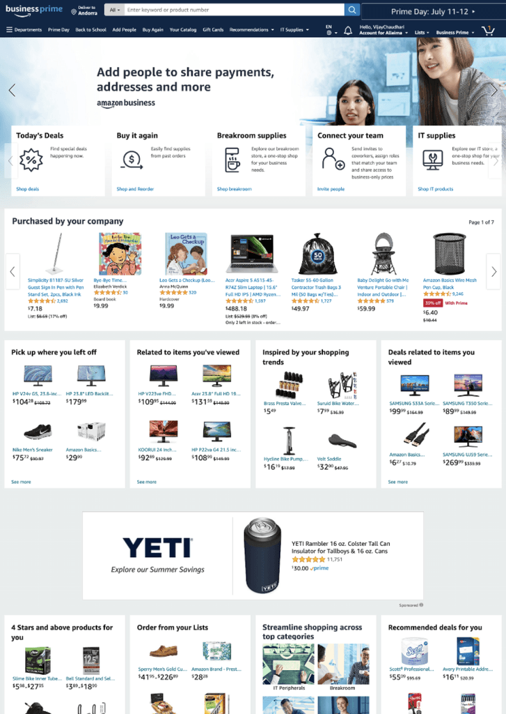
From qualitative, we realised that scroll rate beyond ATF is too low, while users perceive homepage as irrelevant and indistinguishable from the one in their personal accounts
From quantitative, we noticed low engagement with widgets in ATF, which eventually translates into un-discoverability of widgets in BTF. Apart from few operational or purchasing widgets, others are ignored
Proposal
Deep dive and workshops uncovered key lens of user evaluation when it comes to digital shopping

Make it modular, to have a predictable and modular homepage which can host widgets to enable all types of customers achieve their tasks
Make it insightful, to provide deeper insights to customers based on their activity
Make it a gateway, as it cannot solve for everything, but we will pro-actively guide customers and on-board towards their missions
Created by Gautam Chaitanya