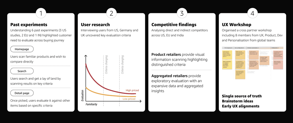
Analysed past learnings
Studied user insights from 3 regions (US, UK & DE)
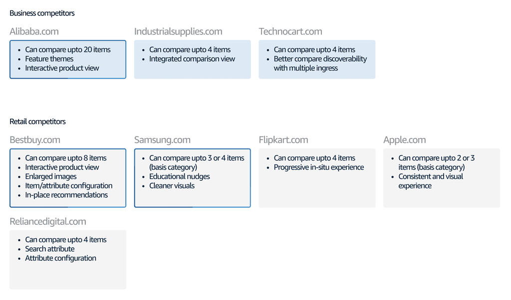
Conducted competitive bench-marking

Organised workshops with IN, EU & US designers
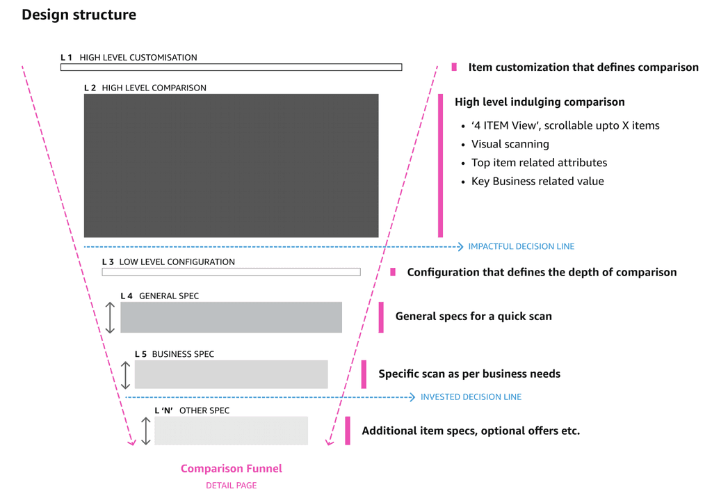
Created a north star UX vision for comparison
Delivered and launched Phase 0 & 1 designs
Challenge
Creating a configurable product comparison experience enabling users to evaluate interested items efficiently based on their business specific needs.
My role
As a UX owner, I dove deep into existing and past learnings, competitive analysis and defined a north star UX vision for comparison table.
Team
UX owner (Myself), Product manager, Technical program manager, Tech team
Highlights
Launched world-wide,
High business impact
Live experience
Impact
12x business impact vs initially projected,
36% increase in engagement
Approach
Product comparison is a key step into user evaluation and purchase decision. My overarching approach was to connect evolved user behaviour from past and create a delightful experience with minimum disruption.

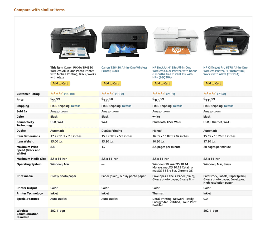
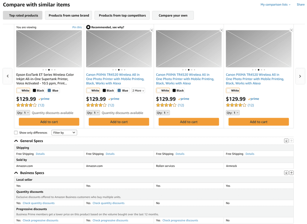
Existing UX is static
Users find it difficult to 1) select products they want, 2) Understand technical jargons, 3) Compare products through specific attributes and 4) save and share with co-workers to evaluate collectively
And they end up resorting to 1) opening multiple tabs, 2) sharing multiple product links, 3) Compare on 3rd party websites and 4) sometime abandon purchasing.
Quotes
“You can’t really compare phones on the Amazon website, that’s a weakness. You have to manually compare or go to a different site.”
(UK)
Negatives
“4.7-inch retina HD display? I have no idea what that means. I feel like I should probably ought to be looking at what these things are before I start shopping. “
(US)
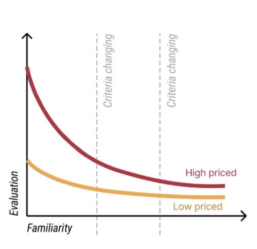
From deep dive, we realised comparison is through lens of familiarity & evaluation
Deep dive and workshops uncovered key lens of user evaluation when it comes to digital shopping
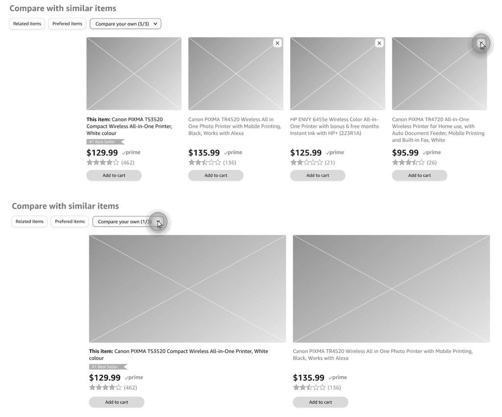
Option 1
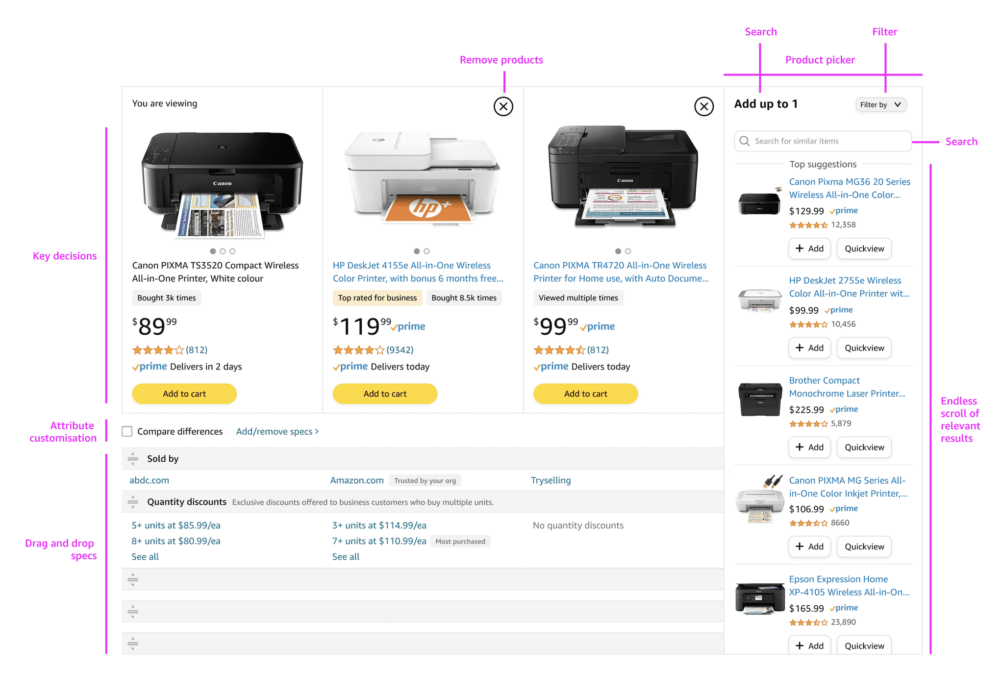
Dynamic columns: Users can remove un-desired products from the compare view for deep and focused evaluation
Pros: Clean and legible comparison view
Cons: 1) Reduces discoverability, 2) Difficult to scale and 3) Technically challenging
Exploring designs and weighing options
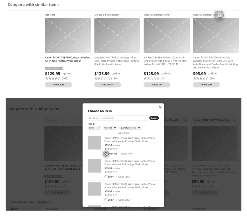
Option 2
Contextual side sheet: Users can select items from a side panel, a familiar behaviour for discoverability of items and information
Pros: Familiar pattern and gives scalable
Cons: Too much dependancy on side sheet, with increased latency
Conflict
Tech pushed for this as an existing template was available. I pushed back after discovering low engagement with side panel on other features
Negatives
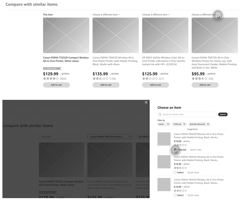
Option 3
Contextual Pop-over/modal: Users can discover relevant items from a pop-over which provides a focused product selection experience without losing context
Pros: Provides discoverability, scalability and cleaner comparison
Cons: Over used component and guidance from DS system to avoid using modals
Conflict
Core search team pushed back on replicating search experience within a modal due to framework changes
Negatives
Testing with users
In place product picker
Tested with 7 users from US/EU
Overall interactions were easily understood while users like the customisation and configuration of the product picker
Highlights: Overall positive reactions from customers, currently pursuing Amazon patent for product picker component, retail teams are keen to collaborate and on-board feature to all customers

Proposal
Make it configurable. Experience that enable customers to choose products of their choice and evaluate against relevant criteria
Make it insightful. Highlighting value and key insights relevant to the customers in making their purchasing decisions
Make it contextual. Proving an experience which takes in user context from past signals and journey
Make it scalable. Enabling customers to evaluate products across relevant touch-points within their journey

Created by Gautam Chaitanya